Brent Yarina, BTN.com Senior Editor, June 15, 2012

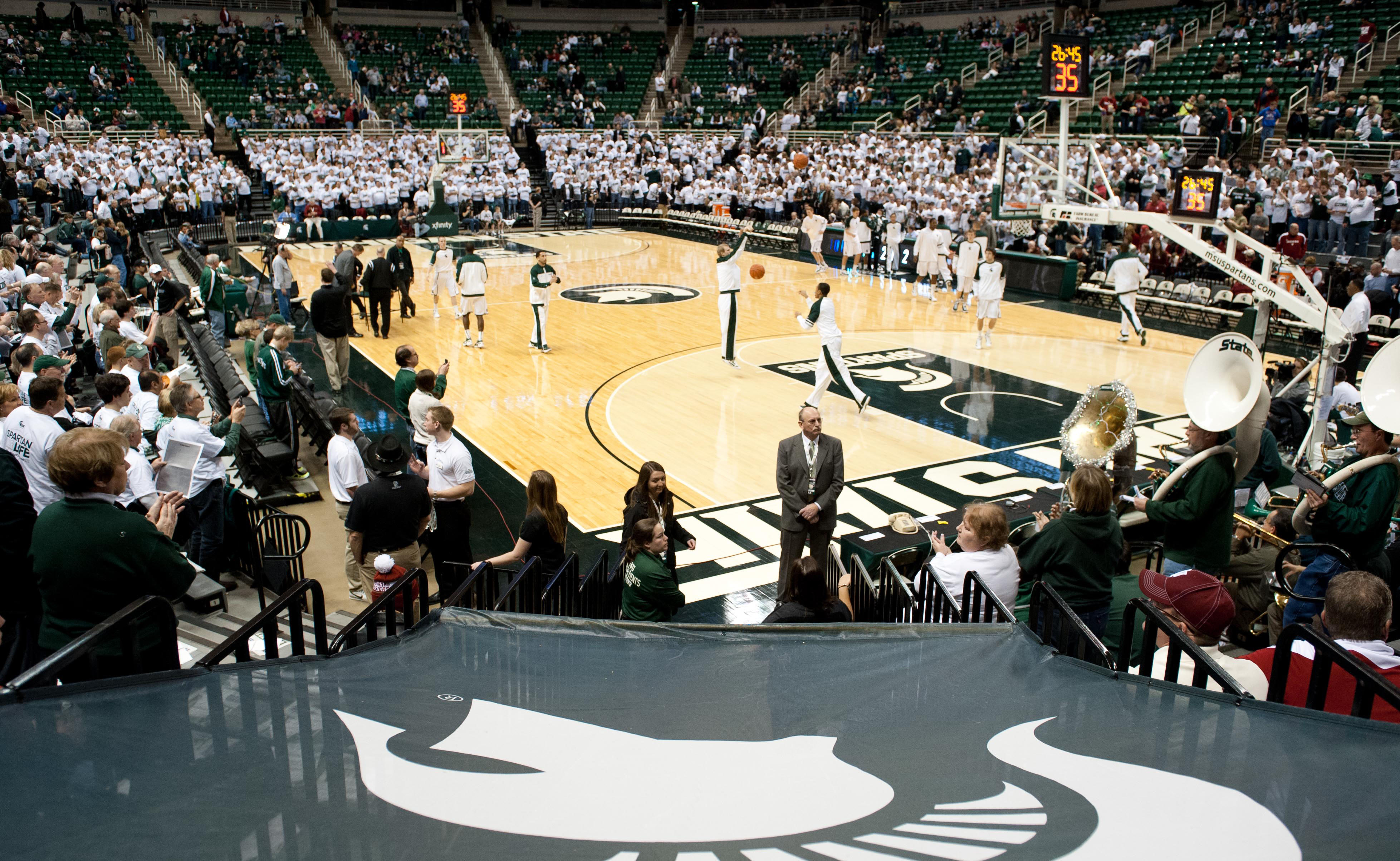
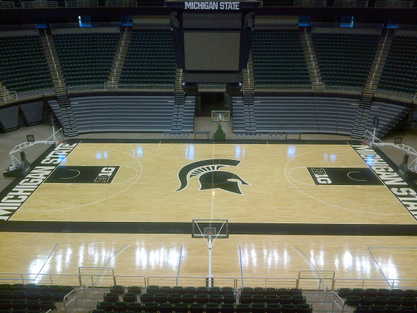
Another season, another new look for the Breslin Center floor. @MSU_Basketball tweeted a photo Friday afternoon of the school's redesigned basketball court, its third look in as many years. If you recall, Michigan State introduced this court last season — a change made partly because of Nike's new Michigan State logo — after playing several years on this court. See the picture in this post.
I dig the new design, just as I liked last year's facelift. The biggest change has to be the larger Spartan logo at midcourt. Other changes include a single-toned floor — last year?s court featured lighter wood inside the 3-point arc — and the ?B1G? logo taking the place of the Spartan logo and ?SPARTANS? in the key.
One other difference: the women's 3-point line, which was on the court last season despite being obselete, has been removed.
Here's last year's court:

What do you think?
BTN.com web editor Brent Yarina writes the Clothes Call features. Send him your Big Ten fashion tips here, find all of his work here and follow him on Twitter at @BTNBrentYarina.


 Find available live basketball action on our B1G+ app via BigTenPlus.com.