


Brent Yarina, BTN.com Senior Editor, April 25, 2012

According to The Exponent, Purdue will have a new logo in the coming months. Like the old one, it still features the train, only with a few tweaks, recommended by Nike. See the logo in this post.
[BTN.com: Purdue gives Motion "P" logo slight makeover]
Here's a quote from The Exponent on the new logo:
"It's really a Nike driven initiative," Associate Athletics Director Tom Schott said. "Nike had come to us a while back with some suggestions. Nike said the train logo we used was not good on apparel. The smoke didn't work on shirts and hats. They recommended this slight revision."
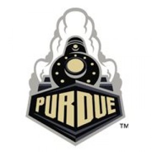
See the old logo below:

So, as you can see, it's not a HUGE change. Everything is centered, that's the biggest difference. Other changes: the "P" on the front of the engine is gone, the "PURDUE" is smaller, written all in one color (gold) and placed on an all-black background, and there's less old gold throughout.
[BTN.com: Purdue puts new train logo on football jerseys]
What do you think? Vote below.
Sure looks like Purdue fans aren't too excited about the change. One Purdue fan even tweeted me his redesign. See it below:
https://twitter.com/#!/scbb11Sketch/status/196313018370506753
BTN.com web editor Brent Yarina writes the Clothes Call features. Send him your Big Ten fashion tips here, find all of his work here and follow him on Twitter at @BTNBrentYarina.