Brent Yarina, BTN.com Senior Editor, February 4, 2013

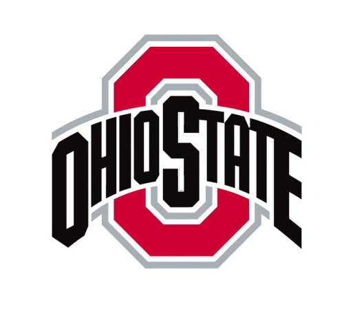
Often times, sports fans need a lot of time to adapt to any sudden uniform or logo changes their favorite teams make. We're seeing proof of that with Monday's release of Ohio State's new athletic logo. See the new logo in this post.
[ RELATED: Ohio State to wear Nike Hyper Elite uniform at Michigan ]
Not a major difference, right? The only real change is that "OHIO STATE" is now written in all-black. As several people have cracked on social media, it almost looks like Ohio State took a Sharpie to its logo or hit the "paint bucket."
According to Cleveland.com, school officials said the logo change was all part of Ohio State's mission to give the school a singular identity - something people would look at and immediately know it was Ohio State. Other school logos were redesigned as a part of the movement, as well.That's all well and good, but a quick search across social media sites shows that Ohio State backers – and people in general – aren't exactly fans of the new logo. They'll just have to get used to it. And they probably will in time.
Here are some tweets about the new logo:
Ohio State's athletic logo was already lacking. Why not just go with the block O?
— Jeff Svoboda (@JeffSvoboda) February 4, 2013
Ohio State's new logo is their old logo colored in with a Sharpie. They paid someone millions to do this. Phenomenal.
— The Walmart Wolverine (@TheWalMartWolv) February 4, 2013
This new Ohio State logo: http://t.co/pFwg3ODa reminds me of this: http://t.co/8XMMBIEc
— Chris Vannini (@ChrisVannini) February 4, 2013
The new Ohio State athletic logo is terrible. Who thought that was a good idea?
— Colby MacMillan (@ColbyMac10) February 5, 2013
And here's a good tweet that shows the old design and new design side by side:
I can totally understand why people are so angry about the new Ohio State logo. Such a radical redesign… pic.twitter.com/dRnqHDx4
— Dustin Godsey (@dgodz) February 4, 2013
| About Brent Yarina | BTN.com web editor Brent Yarina covers football and men's basketball for BTN.com. He writes the popular uniform feature "Clothes Call," which also focuses on the latest cosmetic changes across Big Ten arenas and stadiums. Read all of his work here. You can subscribe to Yarina's RSS feed and follow him on Twitter @BTNBrentYarina. |


 See what's coming up live on B1G+ every day of the season at BigTenPlus.com.