Brent Yarina, BTN.com Senior Editor, July 11, 2016
Uniform rankings are a summer staple.
[ MORE: Top 7 quarterbacks | Top 10 wide receivers | Top 10 running backs | Top 10 offensive linemen | Full unit rankings ]
It makes sense. After all, people love uniforms, plus it seems like no two fans feel the same way about a design.
Speaking of designs, nowadays, most teams almost have too many to count, much less rank accurately. For example, a team could have the best primary designs, but it's alternates or loud helmets could bring the overall collection down. How does a ranker account for that?
As a result, I thought it would be fun to rank my top 10 Big Ten uniforms worn in 2015.
Here's my list, in descending order.
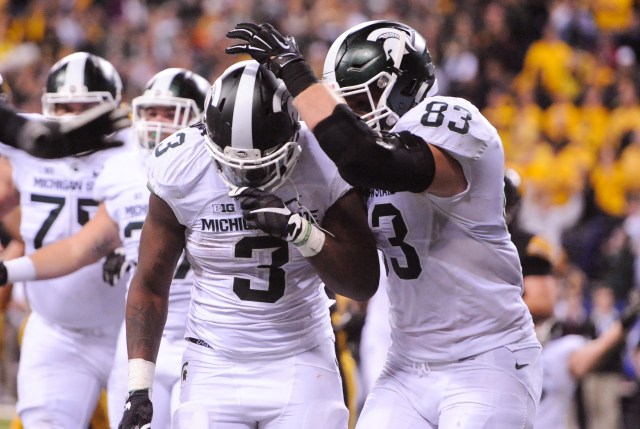
10. Michigan State (away). Always a fan of white-on-white on the road, the Spartans improved this design a couple years ago by getting rid of the odd green accents. This combination isn't as sharp as it was during the Javon Ringer era, but it's still one of my favorites.
***
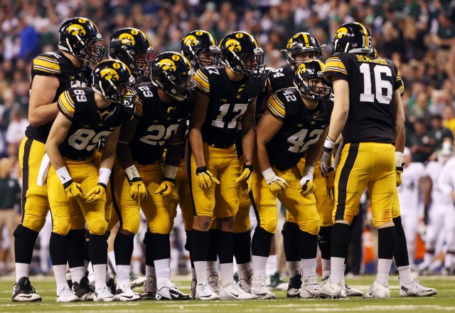
9. Iowa (home). A polarizing uniform, it seems, the Hawkeyes home combination is one of the Big Ten's most recognizable. It looks good, too, even if people never cease to remind you that it's a copy of the Pittsburgh Steelers uniform.
***
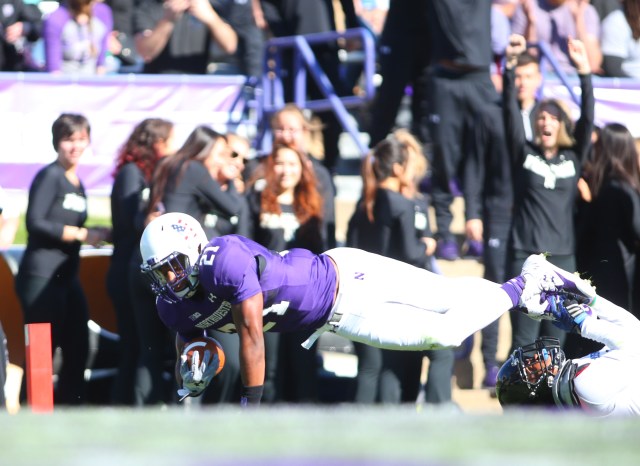
8. Northwestern (home alternate). The Northwestern stripe is one of the most creative college football uniform elements, and, although it isn't as noticeable on Northwestern's darker home shades as it is on the road white, it helps make this white-purple-white combination one of my favorites in the Big Ten.
***
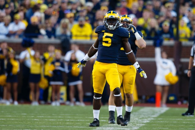
7. Michigan (home). While the maize wasn't very maize in Michigan's years with adidas, the iconic home threads still resonated. The good news is, the color should be more what Michigan fans are used to this fall, in Year 1 with the Jordan Brand.
***
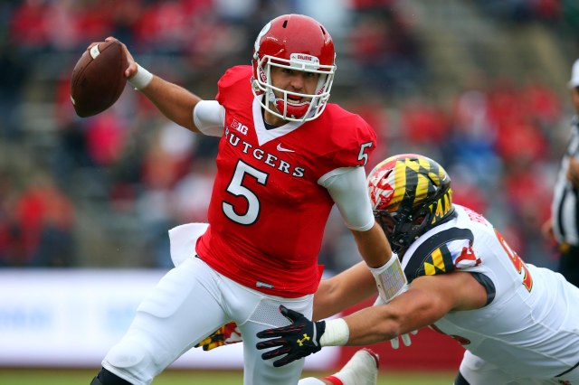
6. Rutgers (home throwback). Sometimes, the answer is turning the clock back to a not-so-long-ago design. Not only is this Greg Schiano-era unifiorm fantastic, it's a welcome change of pace from Rutgers' current love affair with monochromatic uniforms.
***
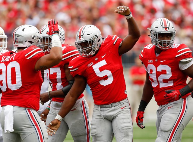
5. Ohio State (home). Surprisingly, Ohio State hasn't shied away from alternates in recent years. There's no need to mess with this iconic look, though. The colors are great, as are the helmet and Buckeye stickers that fill the lid late in the season.
***
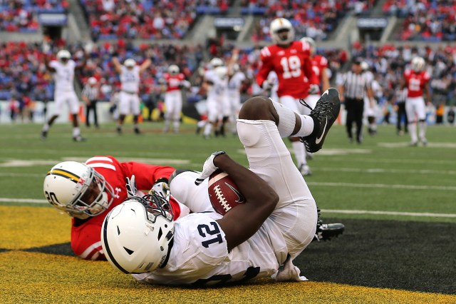
4. Penn State (away). Other than Texas, few do all-white better than Penn State. Critics say it's too boring, that it resembles a junior high uniform, but it looks good and everyone knows who's playing when these dandies are on the television.
***
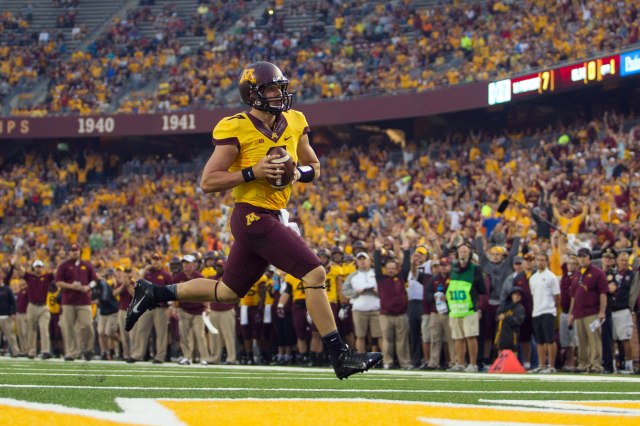
3. Minnesota (home alternate). It isn't an overwhelming favorite, based on previous rankings I've done, but there's something about this design that I really like. The only thing I don't like about it, in fact, is the overused, distracting and way-too-thick Nike collar.
***
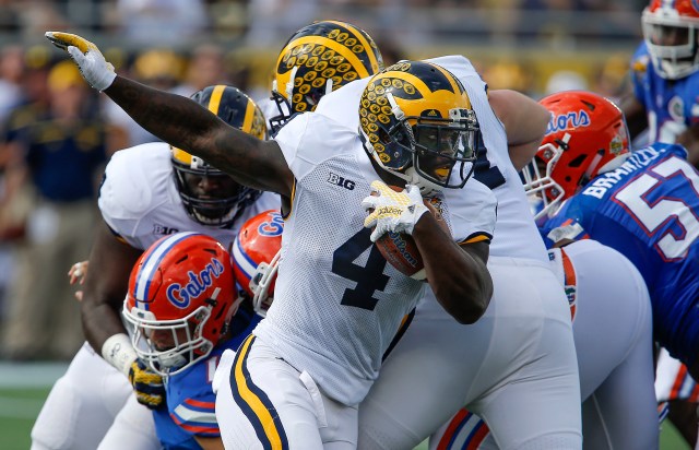
2. Michigan (away). The 1974-inspired all-white throwback more than made up for what adidas had done to Michigan's road uniform, and to a lesser extent the home design, in recent seasons. This is such a clean look, made even more classic by the stripes on the sleeves and down the pants.
***
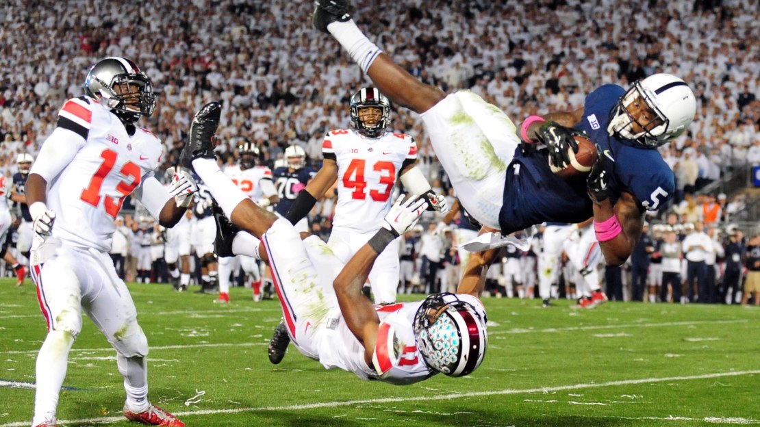
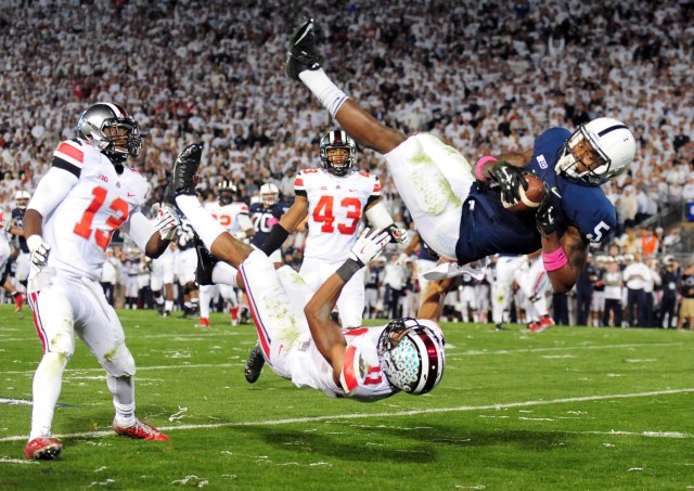
1. Penn State (home). It's a classic, one that has seen minor changes and upgrades over the years, and it's one that shouldn't be touched. Two things: 1. Keep the surnames off the nameplates; and 2. there are few better Big Ten stadium sights than this uniform in front of a Beaver Stadium whiteout.


 See what's coming up live on B1G+ every day of the season at BigTenPlus.com.