Sean Merriman, BTN.com web editor, March 1, 2014
Alternate uniforms are one of the biggest fads throughout today's college football world. Athletic apparel powerhouses such as Nike, Adidas and Under Armour have created plenty of loud, eye-popping jerseys over the past several years. As impressive as some of those jersey designs have been, Dettrick Maddox, a design star who goes by @MrDesignJunky on Twitter, is raising the bar with some of his recent alternate uniform design concepts.
One of Mr. Junkie's recent creations is an Ohio State Nike concept look. The uniform consists of a grey, white and red combination with the Ohio State "O" in the center of the jersey, which is traditionally where the uniform number would be. In this concept, the jersey number appears on the upper right shoulder, with small buckeye logos over the left shoulder.
Here is a look at the uniform designs.
#osu #ohiostate #buckeyes #bcs #nike #ncaa #mrdesignjunkie pic.twitter.com/4WeSmCpGFQ
— Dettrick Maddox (@MrDesignJunkie) February 23, 2014
Of course this is simply a concept design, which means that Ohio State are not actually wearing these in games. However, if they did wear something like this, I would be in favor of it. My favorite is the grey-on-grey look with the black Nike socks, although I would like to see what a red jersey would look like.
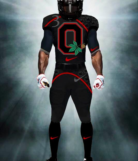
Here is a black-on-black version of the uniform, which @MrDesignJunky revealed in December. Now this would certainly catch some eyes if the Buckeyes wore something like this in a game.
@TedGinnJr_19 New Ohio State "Black Out" concept uni #OSU #OhioState #Buckeyes #BuckeyeNation #ncaa #BCS pic.twitter.com/t9xj4u1JZE
— Dettrick Maddox (@MrDesignJunkie) December 8, 2013
Take some notes, Nike. If Ohio State ever went away from their traditional uniforms, this would be a great look for the Buckeyes.


 See what's coming up live on B1G+ every day of the season at BigTenPlus.com.