


 WATCH LIVE: Select Spring Football, lacrosse quarterfinals, tennis championships and more.
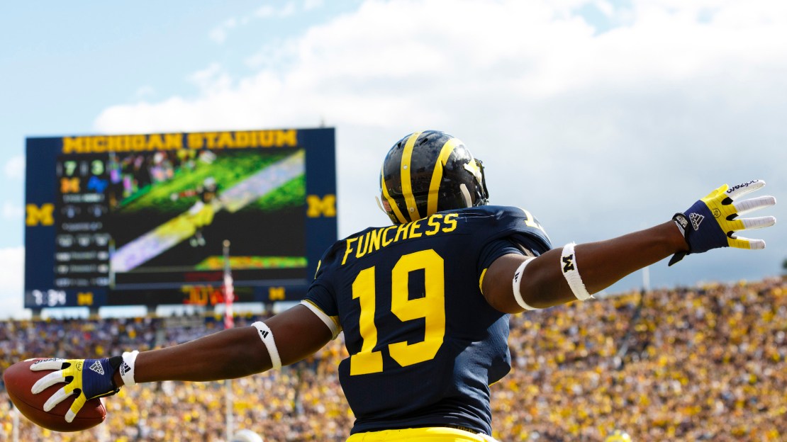
Brent Yarina, BTN.com Senior Editor, July 3, 2013
What's better than your typical Big Ten football uniform power ranking? A uniform ranking decided by 12 Big Ten writers, that's what. BTN.com recently asked a writer for every school to rank the conference's uniforms, from 1-12. We asked the writers to consider the uniforms as a whole, factoring in home, away, alternate(s) and helmet(s).
Editor's note: The final ranking was determined using point totals (12 points for No. 1 ranking; 1 point for No. 12 ranking; etc.) and it is listed in order, from most points to fewest points.
[ RELATED: Michigan wins 2013 Big Ten Helmet Bracket ]
BIG TEN WRITERS' FINAL RANKINGS
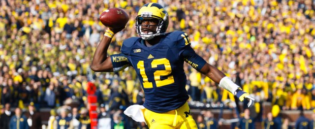
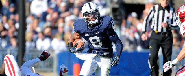
1. MICHIGAN, 134 – The winged helmet and simple maize and blue combos make for one of the most iconic looks in college football. – Brian Rosenthal (@HuskerExtraBR), HuskerExtra.com
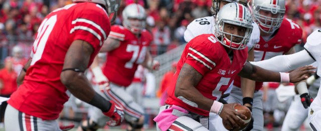
2. OHIO STATE, 115 – Sort of like Michigan, Ohio State?s look (when it?s not being messed with by Nike) is classic. When the Buckeyes take the field, you?re not mistaking them for anyone else. – Nick Baumgardner (@nickbaumgardner), MLive.com
3. PENN STATE, 108 – When it comes to uniforms, the simpler is always better in my book, and it simply doesn't get much simpler than Penn State. – Tom Fornelli (@TomFornelli), thechampaignroom.com
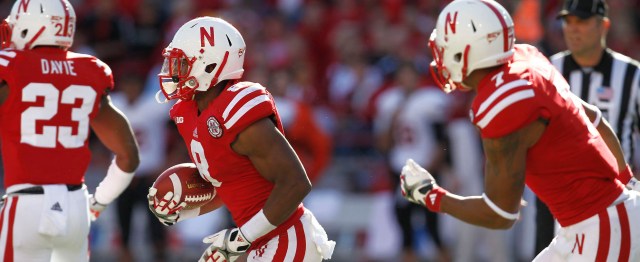
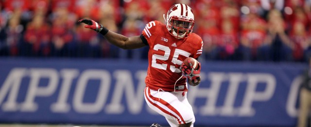
4. NEBRASKA, 93 – One of the best road uniforms in the game. – Ben Jones (@Ben_Jones88), StateCollege.com
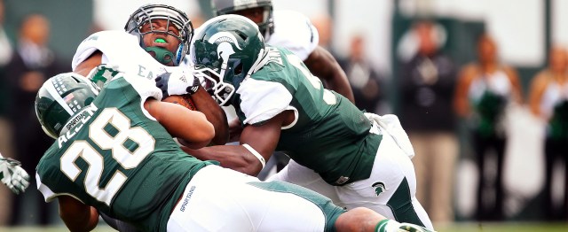
5. MICHIGAN STATE, 91 – Big fan of the Spartan helmet. They often play with their uniforms but unlike their basketball team it usually works more than it doesn?t. – Adam Johnson (@crimsonquarry), crimsonquarry.com
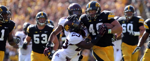
6. IOWA, 89 – I hate to say it, but their black and gold looks better than ours. – Travis Miller (@HammerAndRails), HammerandRails.com
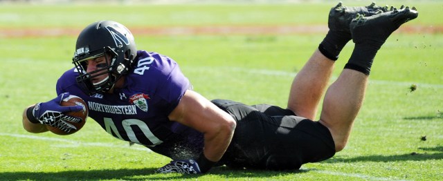
7. NORTHWESTERN, 75 – College football uniform equivalent of a neatly designed résumé. – Nick Medline (@NMedlineFOX), purplewildcats.com
8. WISCONSIN, 70 – Very similar to Nebraska, obviously, and the all-white road uniforms are slick. I can?t get into that ?W? logo, though. I?m not sure why. – Brian Rosenthal (@HuskerExtraBR), HuskerExtra.com
9. PURDUE, 51 – White, black and gold doesn?t give you much to work with. And it shows. – Nick Baumgardner (@nickbaumgardner), MLive.com
10. MINNESOTA, 46 – I?m a big fan of this new look. The unique font and the color scheme work well, and the helmets have come a long way since those red things with the teeny, tiny logo. – Chris Vannini (@ChrisVannini), theonlycolors.com
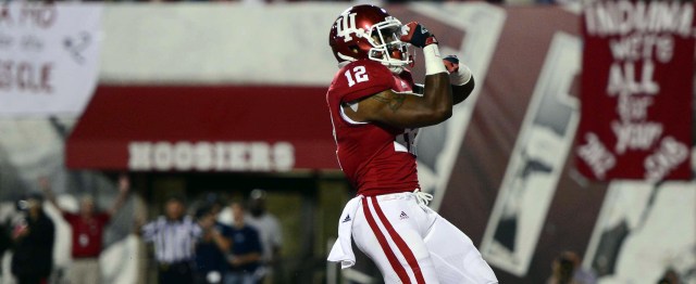
11. INDIANA, 33 – Kevin Wilson is working on changing what?s stale but the candy striped helmets remind me of an after dinner mint. – Rick Reese (@PlannedSickDays), blackheartgoldpants.com
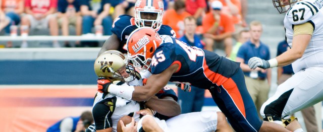
12. ILLINOIS, 31 – Blue and orange. That?s what the Illini are dealing with. So, that automatically puts them behind the 8-ball and they?ve never been able to overcome that obstacle. – Dave Biddle (@davebiddle), bucknuts.com
HIGHEST & LOWEST RANKING
Illinois: 8th; 12th
Indiana: 5th; 12th
Iowa: 2nd; 10th
Michigan: 1st; 4th
Michigan State: 1st; 8th
Minnesota: 1st; 12th
Nebraska: 2nd; 9th
Northwestern: 1st; 12th
Ohio State: 1st; 6th
Penn State: 1st; 9th
Purdue: 6th; 12th
Wisconsin: 5th; 12th
NOTEWORTHY NUMBERS:
- Michigan received six first-place votes, four more than its closet competitor (Ohio State)
- Northwestern and Minnesota each received a first-place and last-place vote
- Six teams received first place votes (Michigan, 6; Ohio State, 2; Northwestern, Michigan State, Minnesota & Penn State, 1)
- Indiana had the most last-place votes (5)
Take a look at how each writer ranked the Big Ten uniforms below.
TOM FORNELLI (@TomFornelli), thechampaignroom.com
1. Penn State: When it comes to uniforms, the simpler is always better in my book, and it simply doesn't get much simpler than Penn State.
2. Michigan: Michigan's helmet almost moves it to number one. Almost.
3. Ohio State
4. Iowa: I've always liked the actual Hawkeye logo and the other is that I just love the combination of yellow and black.
5. Wisconsin
6. Nebraska
7. Michigan State
8. Minnesota: I don't know why I like Minnesota's uniforms more than the others. I just do.
9. Northwestern
10. Purdue
11. Illinois: I really wish Illinois would do something with their uniforms that wasn't so boring. They've made some changes in recent years that have me optimistic. Nothing crazy, as I like simple, but what's memorable about Illinois uniforms? Exactly.
12. Indiana: Did you see the new Indiana uniform combos? Yeah, I ranked them 12th because there are 12 teams, but they're really somewhere around 45th.
ADAM JOHNSON (@crimsonquarry), crimsonquarry.com
1. Michigan: Really like the helmets and their very unique striping. Maize and blue is a great combination of colors and they never venture too far from their traditional garb.
2. Penn State: I really like the traditional look of Penn State. Like the Yankees in baseball, Penn State is all about tradition and continuity. Luckily that continuity is a great look for the Nittany Lions.
3. Northwestern: Purple and black does it for me.
4. Michigan State: Big fan of the Spartan helmet. They often play with their uniforms but unlike their basketball team it usually works more than it doesn?t. The spartan on the helmet is a quality look and I?d venture to say that they have the best mascot in the conference.
5. Ohio State: I think tradition speaks more to the actual appeal of these uniforms. The spamming of stickers on the helmet are a little annoying and drops them further down than they probably should be.
6. Wisconsin: I like the ?W?. There really isn?t a whole lot more I can add.
7. Indiana: What can I say? I?m a sucker for gimmicks and their new Indiana state flag helmets catch my fancy. A lot of people are really dogging on the crazy crimson and chrome stripes but I?m a homer and don?t completely hate them.
8. Nebraska: Red and white is great but a boring ?N? on the helmet doesn?t do much to pop for the television audience.
9. Iowa: Black and gold is an OK combo, but I?ve never been a real fan of that hawkeye logo.
10. Purdue: If Iowa?s black and gold is OK then Purdue?s version of gold is just yuck. Old gold just feels too 80s for the current college landscape. It?s old without an heir of tradition.
11. Illinois: Orange and ugly, nuff said.
12. Minnesota: Maroon and gold should be right up my alley. Minnesota rocks the same colors and school song as my high school growing up but when it doesn?t apply to you directly it is just drab. No thanks.
RICK REESE (@PlannedSickDays), blackheartgoldpants.com
1. Ohio State: Gets the nod over Penn State because they even do their alternates right. Besides, the Buckeye leaf sticker is still one of the coolest thing in college football.
2. Penn State: Classic, clean.
3. Nebraska: I moved them up for going black against UCLA. Still, what was last year?s Domino?s ?Avoid the Noid? uniforms?
4. Michigan: The helmet should push Michigan to number one but those alternates are terrible.
5. Iowa: While many schools are opting for special black alternate jerseys, Iowa wears them every home game.
6. Wisconsin: Classic but what was with the ?W? alternates?
7. Northwestern: I love the black unis but they get pushed down the list because the purple stripe reminds me of a 1980?s style sweatsock.
8. Michigan State: Plain and boring, like their offense.
9. Minnesota: The matte maroon is okay.
10. Illinois: The dark blue is nice, especially the helmets but the orange reminds me of deer hunting season.
11. Indiana: Kevin Wilson is working on changing what?s stale but the candy striped helmets remind me of an after dinner mint.
12. Purdue: As Our Most Hated Rival (OHMR) I?m obligated to include Purdue at the bottom of any list.
NICK BAUMGARDNER (@nickbaumgardner), MLive.com
1. Michigan: The Wolverines arguably have the most recognizable helmet in college football. And when Adidas isn?t butchering its jersey combos, Michigan?s classic maize and blue look is pretty iconic.
2. Iowa: Maybe I?m spending too much time on the helmets here, maybe not. But I?m a big fan of the Tigerhawk logo on one side. Very classic look, clean, dependable.
3. Ohio State: Sort of like Michigan, Ohio State?s look (when it?s not being messed with by Nike) is classic. When the Buckeyes take the field, you?re not mistaking them for anyone else.
4. Michigan State: Maybe the one team that does alternate uniforms better than anyone else. I may be in the minority, but I thought those bronze and green combat uniforms they wore against Michigan in 2011 were awesome.
5. Nebraska: The iconic ?N? on the helmet is cool enough to put the Huskers in the top half.
6. Penn State: The Nittany Lions would be a lot higher on my list if Bill O?Brien hadn?t tinkered with this otherwise classic look.
7. Northwestern: Wearing purple all the time looks a lot better when you?re winning, doesn?t it, Pat Fitzgerald?
8. Wisconsin: The Badgers? look has always been a bit too plain for me. Just, sort of, whatever.
9. Purdue: White, black and gold doesn?t give you much to work with. And it shows.
10. Indiana: Candystripes only work in Assembly Hall, Hoosiers.
11. Minnesota: There?s always just way too much going on. And, it seems like they?re wearing something different every time I see them.
12. Illinois: Not their fault, Bright orange mixed with blue just clashes. Always. And forever.
CHRIS VANNINI (@ChrisVannini), theonlycolors.com
1. Northwestern: The new set, it just works wonderfully. The horizontal stripe across the middle is unique, but not too wild, and adding the black jersey and black helmet looked good, too. Despite it being new, I hope this design stays for a while.
2. Michigan: The blue jersey is simple and traditional, and although Michigan didn?t invent the winged helmet, they?ve become synonymous with it. I thought the 2005-07 white jersey was fantastic with some subtle piping and a clean white. Nowadays, different players are wearing different jerseys on the road.
3. Ohio State: The pre-2006 look was better. Too much black, not enough gray on the current set. Love the helmet.
4. Michigan State: I?m not a huge fan of the bronze, but the 2010 redesign did a good job of mixing both old and new. The green shoulders on the white jersey work well, but I?d love to see an all-white road jersey, like the Spartans used to have.
5. Nebraska: A classic look with enough going on, unlike Penn State. The sans-serif N on the helmet should be the university-wide logo, rather than the block. I like the new positioning of the wider shoulder stripes
6. Wisconsin: Seeing Wisconsin?s alternate against Nebraska last year made me wish the Badgers moved to that old W, rather than the ClipArt one they use now. The double-stripe being present on the helmet, jersey and pants is a nice consistency. The other problem is they?re the same as Nebraska?s 90s look, without the tradition.
7. Minnesota: I?m a big fan of this new look. The unique font and the color scheme work well, and the helmets have come a long way since those red things with the teeny, tiny logo.
8. Penn State: I understand and appreciate simplicity, and I thought putting the names on the jerseys last year looked good, but I just don?t get excited about these like most people do.
9. Purdue: I would have put the Boilermakers higher before the recent switch. Gone is the white from the home jersey and the helmet, and the new number font looks kind of cheap. It?s too bad. Purdue?s previous look was top-notch. I'd like to see a gold alternate again.
10. Iowa: It?s just the Pittsburgh Steelers jersey with block numbers. The alternate jerseys the Hawkeyes have worn in recent years are more unique.
11. Indiana: Jerseys are boring, but the Hoosiers avoid the bottom spot on my list because of their new helmets. When you don?t have much of a tradition, you can mix things up, and honestly, I?m a huge fan of the chrome one.
12. Illinois: I like the colors, but all the piping on the jerseys is too much. The helmet is pretty bland, though I do like mixing things up with the matte blue one.
Rob Litt (@GopherHole); gopherhole.com
1. Minnesota: The U unveiled new uniforms last year and these are a perfect combination of modern design while paying attention's to the program's storied past with the letter font and the bricks embedded in the jersey. Not to mention the best helmets in college football.
2. Penn State: Few programs master simplicity with branding like Penn State. Nothing too flashy, yet still attractive to recruits. A great combo.
3. Michigan
4. Northwestern
5. Ohio State
6. Nebraska
7. Michigan State: They are trying way too hard to be Oregon with some of their uniform combinations.
8. Purdue
9. Illinois
10. Iowa: Who hates Iowa's uniforms? We hate Iowa's uniforms.
11. Indiana: The uniforms are brutal. Only to be outdone with five helmets. Any program that has five helmets has no program identity.
12. Wisconsin: A widely held view by Big Ten fans across the country, Wisconsin has the worst uniforms in the Big Ten, hands down. The Badgers are fortunate that Maryland is entering the conference, otherwise the worst uniform banner would have been a consistent mantle for the Badgers to carry.
BRIAN ROSENTHAL (@HuskerExtraBR), HuskerExtra.com
1. Michigan: The winged helmet and simple maize and blue combos make for one of the most iconic looks in college football.
2. Penn State: The Nittany Lions? uniforms may take my ?less is more? approach to an extreme. Yes, they?re a little bland, but you always know that?s Penn State playing.
3. Nebraska: The red ?N? on the helmets is as traditional as it gets, and count me among those who actually prefer the road uniforms (red pants) over the home ones. I wasn?t a fan of last year?s alternative uniforms, but this year?s black jerseys, with the white matte helmet, look sharp.
4. Ohio State: Sticking with the tradition helmet theme, Ohio State gets credit for the Buckeye leaves helmet stickers.
5. Wisconsin: Very similar to Nebraska, obviously, and the all-white road uniforms are slick. I can?t get into that ?W? logo, though. I?m not sure why.
6. Iowa: The gold pants are a staple in Iowa City, and the Hawkeye logo is underrated.
7. Michigan State: OK, not great. Pretty understated, which I like, with a recognizable logo. And while I identify with the Michigan State font, I don?t necessarily like it.
8. Indiana: I actually like some of Indiana?s new uniform designs. Just wish they?d stick with one helmet. And not the candy-cane one.
9. Minnesota: When the Gophers accentuate the maroon, I like. When there?s too much gold, not as much.
10. Purdue: Nothing really sticks out to me, one way or the other.
11. Illinois: Orange and blue don?t do much for me. And neither does the block ILLINOIS on the side of the helmet.
12. Northwestern: Whose idea was it to mix purple and black? Egads.
NICK MEDLINE (@NMedlineFOX), purplewildcats.com
1. Ohio State: Product on the field makes it look that much better.
2. Michigan: How else can you explain the win against Northwestern?
3. Iowa: Nothing flashy, but it's one of the best all-around looks.
4. Northwestern: College football uniform equivalent of a neatly designed résumé.
5. Michigan State: As good as you can make green and white look. Big fan.
6. Nebraska: Uneven. Black alternate uniform? Great. Everything else? Faux pas.
7. Purdue: What you think about when you think about Purdue: average.
8. Illinois: Watching them play is much uglier, though. (Too easy.)
9. Penn State: Worse: the uniforms will never really change.
10. Wisconsin: Nebraska game alternate uniforms by far the worst look last season.
11. Minnesota: Terrible. Not even the criminally underrated stadium can overcome the look.
12. Indiana: They're boring.
DAVE BIDDLE (@davebiddle), bucknuts.com
1. Michigan State: The sharpest unis in the Big Ten ever since they replaced the generic ?S? on their helmet with a Spartan. Nike has done a fine job reconstructing the numbers on the jersey - certainly a unique look. The Spartans also stand out from the rest as no one else in the conference features ?green? as one of its colors.
2. Ohio State: An impressive and classic look, but OSU?s uniforms are not quite as good as they used to be when the Buckeyes used bigger numbers on their jerseys. They feature an iconic helmet that begins the year devoid of any markings, but fills up with ?Buckeye Leaves? as the season progresses. Many teams across college football use some variation of this tradition started by OSU (rewarding good plays with decals on helmets).
3. Michigan: Speaking of iconic helmets, nothing is more recognizable than the ?winged? helmet donned by the Wolverines. The rest of UM?s uniform is somewhat bland - Adidas seems to be lagging behind Nike in the design department - but the helmet still makes it one of the best overall uniforms in college football. High school teams across the country - and especially in the Midwest - love to copy either Michigan?s helmet or Ohio State?s helmet.
4. Northwestern: One of the most-boring uniforms in the conference years ago has been replaced with a sleek look. The purple/black fits the Wildcats well and they did a good job of updating the ?N? on their helmet years ago. Not quite as impressive as their transformation into one of the best football programs in the Big Ten, but impressive nonetheless.
5. Indiana: Easily could be higher on this list. Another uniform that has improved exponentially in recent years.
6. Iowa: Love the black/gold colors. The ?Hawkeye? on the helmet is also a good, unique look for Iowa.
7. Penn State: Some might hate it, but I actually like the simplistic nature of the PSU unis. However, I can?t believe they added the players? last names on the backs of uniforms last year. That?s called selling your soul, people. Just kidding. I?ll always like the Penn State uniforms with the plain white helmets, even if I wish they would have kept their jerseys completely old-school and operated sans names on the back.
8. Purdue: Much like Iowa, the Boilermakers get points for the always-sharp black-on-gold look. You just get the feeling they could do more though. (Not just on the field; with their uniforms.)
9. Nebraska: Traditional and classy ? just the way it should be at Nebraska. Never going to rank high on a list like this, but I hope the Cornhuskers never change anything. Much like Penn State, their ultra-basic uniform is synonymous with their program and all the success they?ve achieved over the years.
10. Wisconsin: Too bad there are no Big Ten teams that have some variation of a red/white color scheme. Oh, it?s only 25 percent of the conference with OSU, IU, NU and UW. At least Rutgers and Maryland don?t have red in their uniforms. Oh wait.
11. Illinois: Blue and orange. That?s what the Illini are dealing with. So, that automatically puts them behind the 8-ball and they?ve never been able to overcome that obstacle.
12. Minnesota: I did a straw poll on my site, Bucknuts.com, and the Golden Gophers finished last. Can?t say I disagree, so they land in the cellar. They have potential though. They have the same colors as USC and USC?s uniforms are among the best in college football. Can?t blame this one on the colors, Golden Gophers.
BEN JONES (@Ben_Jones88), StateCollege.com
1. Michigan: Like Penn State, the Wolverines have a straight forward no nonsense uniform. Michigan gets my top spot though because few schools have a helmet quite as iconic.
2. Penn State: If Penn State ever adds old-school Alabama numbers to the helmets like they did for Michael Mauti that would probably make the difference between the No. 1 and No. 2 spot.
3. Nebraska: One of the best road uniforms in the game.
4. Iowa: Underrated by a lot of Big Ten fans, I think Iowa's uniform has a unique edge to it when the lights are on in Iowa City.
5. Wisconsin
6. Ohio State: At the end of the day Ohio State's success makes the uniform more iconic than the design itself, and in a lot of ways they aren't all that different from Nebraska or Wisconsin's.
7. Michigan State
8. Purdue
9. Northwestern
10. Illinois: Not a bad jersey, but it makes me think of basketball more than anything else.
11. Minnesota
12. Indiana: Indiana comes in last on my poll because the new helmets make it look like Christmas became a contact sport more than a stylish new addition to the uniform.
TRAVIS MILLER (@HammerAndRails), HammerandRails.com
1. Michigan: Always been a big fan of there simple, yet classic look.
2. Nebraska: Best of the red.
3. Ohio State: Best late in the season with all of the Buckeye stickers
4. Iowa: I hate to say it, but their black and gold looks better than ours.
5. Penn State: They rarely change, but they are pretty dull too.
6. Purdue: I would be a little higher, but I don't like our new smaller, slanted numbers
7. Wisconsin: Pretty standard, but nice.
8. Michigan State: Pretty good, but too much change lately.
9. Illinois: I kind of like their new matte helmets with the block I
10. Minnesota: Nothing special, but still good.
11. Northwestern: The new ones look like an English soccer club
12. Indiana: I like their block I helmet, but the sparkle-dazzle ones are blinding.
MIKE FIAMMETTA (@mikefiammetta), buckys5thquarter.com
1. Michigan: The winged helmets, beautiful color scheme and consistently successful alternates make Michigan the best. There's room for debate here — I'd venture the Big Ten is a well dressed conference — but those helmets and the maize and blue just screams "college football."
2. Penn State: Again, a classic color scheme. I'm a fan of the decision to add player names to the jerseys, though that's more for reasons beyond just the aesthetics of the jerseys. Both the home and away uniforms are near-perfect, in my mind, and they get points for standing the test of time, especially alongside some of the terrible modern alternates we've seen.
3. Michigan State: I'm a big fan of the green and white scheme, and the unique font is fantastic. The sharp stripe on the pants is fantastic, and a trend I'd love to see adopted elsewhere in the conference.
4. Iowa: Again, color scheme. Steeler black and gold is as good as it gets for football uniforms. The Hawkeye logo is also one of a kind.
5. Ohio State: Others probably have Ohio State higher on this list, but I have trouble ranking highly a scheme so reliant on grey. The Buckeyes on the helmet are sort of cool, though I'm not crazy on pride stickers in general. You also have so many red uniforms in the Big Ten, that you could consider the following two teams on this list somewhat interchangeable along with Ohio State.
6. Wisconsin: Critics say the Motion 'W' on the helmet is too big, but Badgers fans welcomingly embrace it. Red and white is classic, and the Badgers also get bonus points for generally cherishing tradition and avoiding experimentation. We'll consider adidas' recent forays an aberration.
7. Nebraska: Again, red and white. The 'N' logo feels a little too classic, but otherwise these uniforms are great. The upcoming black alternate jerseys look sweet.
8. Purdue: Personally, I'm a big fan of black jerseys. The black and gold usually looks cool, though I'm not a fan of the aways.
9. Minnesota: Cool color scheme, not a fan of the logo.
10. Northwestern: If you like purple, you'll probably rank the 'Cats higher.
11. Illinois: Cool color scheme, not-so-original logo.
12. Indiana: As bland as it gets in the Big Ten. A shame, considering their classic basketball jerseys, perhaps the conference's best.