


Brent Yarina, BTN.com Senior Editor, August 8, 2012
When Tom Dienhart wrote that Penn State should put blue ribbon stickers on both sides of its helmet, it got my attention. No helmet, it seems, is as sacred as Penn State's – not even Michigan's. After all, the Wolverines are coming off a season in which they added numbers to their lids and put gray facemasks in the rotation, both nods to the past. It's back to the usual look in 2012. The last time Penn State made a significant change to its helmet: 1987, when it went from gray to blue facemasks.
That's a commitment to one look. But Penn State and Michigan aren't the only Big Ten teams with iconic lids. Nebraska and Ohio State both are extremely recognizable, as is Iowa.
On the topic of helmets, here is how I rank the Big Ten lids (note: my top three always seem to change):
1. Penn State – The most polarizing of the group, Penn State's classic white lid, with only a blue stripe down the middle and a blue facemask, is so simple and so perfect.
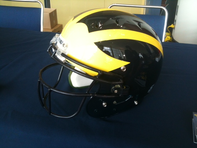
2. Michigan – The winged helmet is a classic look that will forever be popular. Michigan's combination of maize and blue makes it an even sharper look than others.
3. Ohio State – While the lid has gotten a little too sparkly for my liking in recent years, by season's end, the Buckeye stickers make it one of the best looks.
[BTN.com: Clothes Call: Big Ten summer practice edition]
4. Iowa – Yes, the Hawkeyes copied the Pittsburgh Steelers' design, but it works. And there are subtle differences, like the Tigerhawk logo on both sides of the helmet.
 |
| US PRESSWIRE |
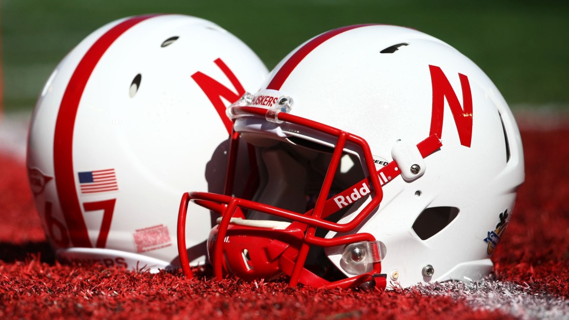
5. Nebraska – Another simple helmet, Nebraska did well going with the Block "N" on both sides. The numbers on the back of the helmet are a nice touch, too.
6. Minnesota – Maroon and gold isn't the easiest combination to make look good, but Minnesota does it, especially with its new matte helmet.
7. Purdue – Often underrated, for whatever reason, Purdue has good colors to work with and incorporates them in a simple, clean look.
8. Michigan State – USC it is not, the Spartans had a better look in recent years. Basically, that incredibly thick white stripe needs to go. Maybe forget about the stripe altogether.
9. Indiana – My little cousin used to think the logo was a cactus, and I can't say I blame him. Oklahoma does this look better.
10. Wisconsin – It's almost a cartoon version of Nebraska's helmet, with that HUGE Motion "W". Go with a smaller old-school "W", and it's much higher on the list.
11. Northwestern – Purple isn't an easy color to work with, but Northwestern's odd-shaped "N" never looks quite right, either.
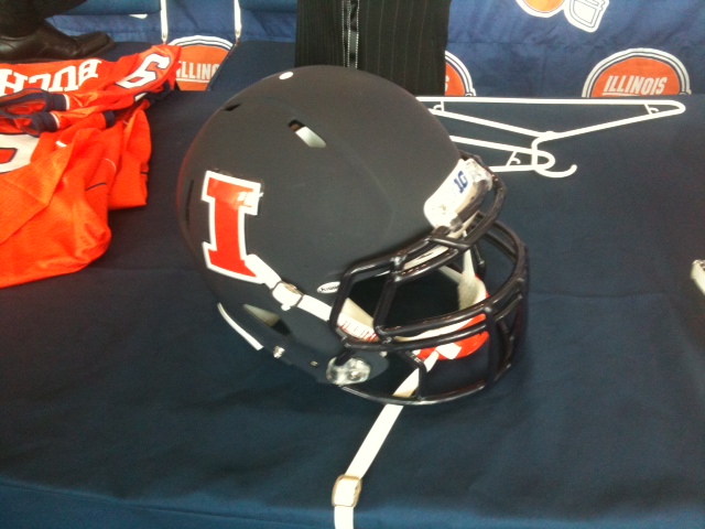
12. Illinois – Uninspiring, to say the least. Go ahead, name another team that has its state name on its helmet (Update: commenter below alerted me Ohio has name on helmet). At least there could be something new next season.
Here's some of the responses I got for best Big Ten helmet on Twitter:
https://twitter.com/doogie1976/status/233252082474418176
@BTNBrentYarina Purdue, Mich, OSU, Minn, Wisc, Neb, Iowa, PSU, MSU, Ill, IU, NW. Not a lot of great helmets when you think about it.
— Stephen Christ (@scbb11Sketch) August 8, 2012
@BTNBrentYarina OSU, UM, Neb, PSU, MSU, Wisc, Iowa, Min, Pur, IU, NW, ILL
— Chris Vannini (@ChrisVannini) August 8, 2012
@BTNBrentYarina Mich, OSU, Minn, Iowa, Purdue, MSU, Wisc, NW, Ill, Neb, PSU, IU
— Brandon Kill (@brandonkill18) August 8, 2012
https://twitter.com/AnthonySLong/status/233228487270481920
@BTNBrentYarina Love my #Huskers, but I like Michigan's helmets the best in conference.
— Scott Benedict (@JF1Edge) August 8, 2012
@BTNBrentYarina well seeing how Michigan is ALWAYS the best helmet, I like northwestern as purple is a unique color
— weirdest/happiest MICH fan (@meiechigan) August 8, 2012
BTN.com web editor Brent Yarina writes the Clothes Call features. Send him your Big Ten fashion tips here, find all of his work here and follow him on Twitter at @BTNBrentYarina.