


Brent Yarina, BTN.com Senior Editor, November 8, 2011
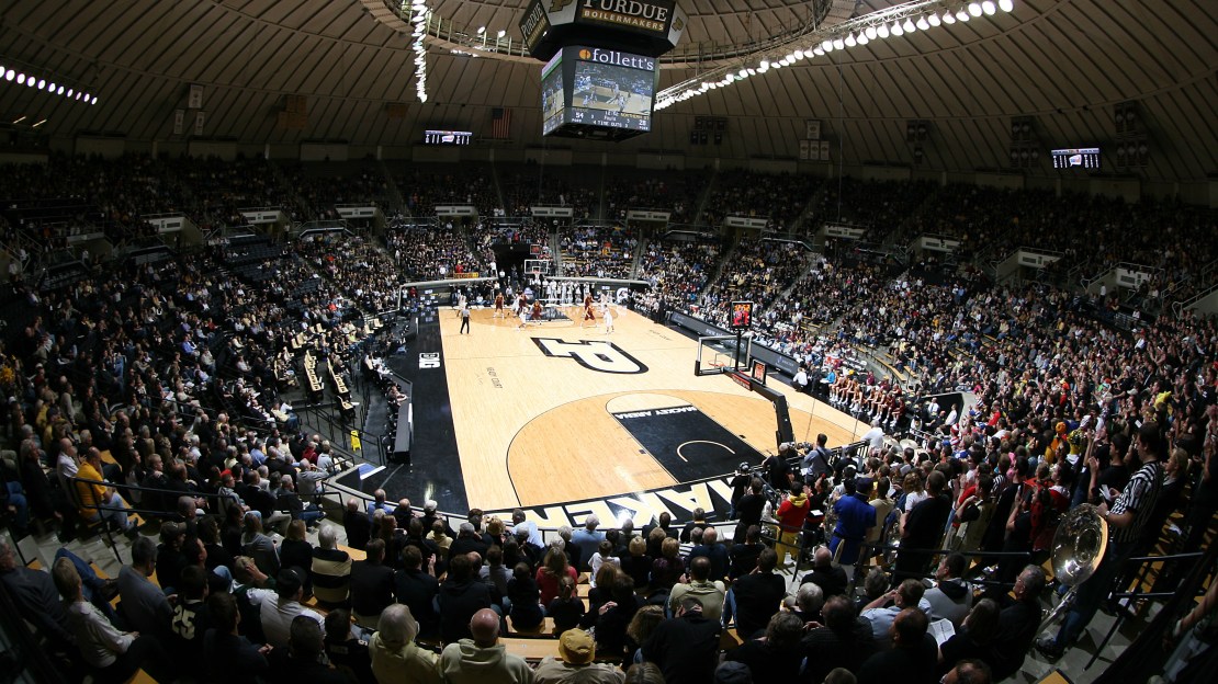
Every Big Ten basketball court will have a different look for the 2011-12 season, whether it be the new B1G logo, the addition of the semi-circle under the basket or the elimination of the women's 3-point line, but at least a handful have undergone other makeovers. The floors at Illinois' Assembly Hall, Carver-Haweye Arena, Crisler Arena, Welsh-Ryan Arena and Mackey Arena will feature new looks when the season tips Friday. Watch a feature on Illinois' new court now and see all the new designs in this post.
Thoughts? To me, the biggest winner of the new designs has to be Purdue, which implements different shades of hardwood – a big-time fad right now – and replaced its midcourt locomotive logo with the school's "P" logo. That's a huge improvement. I've always been a fan of Michigan's court design, and I like the addition of the new shades of hardwood, to go along with keeping the paint untouched. Illinois went with a simpler look, not to mention a lot less blue. Northwestern added a ton of purple – paint on midcourt logo and lines and stain on inside of arc and baselines – and incorporated its school slogan: "Chicago's Big Ten Team." Lastly, Iowa made a less dramatic change, opting to enlarge its midcourt Hawkeye logo, although not to the obnoxious extent of some Big 12 schools.
See our exhibition roundup | Watch our men's hoops preview clips


